I wrote an overly long email to my sister who needs a website for her new business and at some point I thought it would make a good blog post. So here it is (or most of it anyway). I hope it’s not a tl;dr situation…
Hey Sis,
So the first thing to do when you’re planning a website is what you’ve already started doing — looking at other sites and figuring out what you like and what you’re gunna want your site to look like. So that’s good.
The second thing, at least with the way I’m doing sites now using premium themes in wordpress (more on that in a minute), is to start looking at themes and trying to pick one that will do what you want your site to do. The place that I go for good themes is ThemeForest.
I can help you search too, but what you’re going to want to search for are responsive wordpress themes, and you can narrow the search by categories. They make themes for specific uses, like portfolio sites for photographers or graphic designers, to blogs, to ecommerce web shops, and on and on. You don’t necessarily need a theme that is built specifically for your business, but you’ll find some types of themes have the kind of features you want and others are focused on things that won’t be important to you (like photo galleries).
You might want to add “one page” sites to your search criteria if the examples you’ve found that you like are that type. Or you might want each category to have it’s own page. There are arguments for each type. It kind of depends on your content and how extensive you want the site to be.
Now, the reason I’m doing sites exclusively in wordpress with premium themes is this — I used to be trying to figure out how to design sites from scratch and build them in html, but I’m not a coder, so it was always hard and really limiting. I was getting really disheartened. But then the responsive thing came along and became the standard and that changed everything for me.
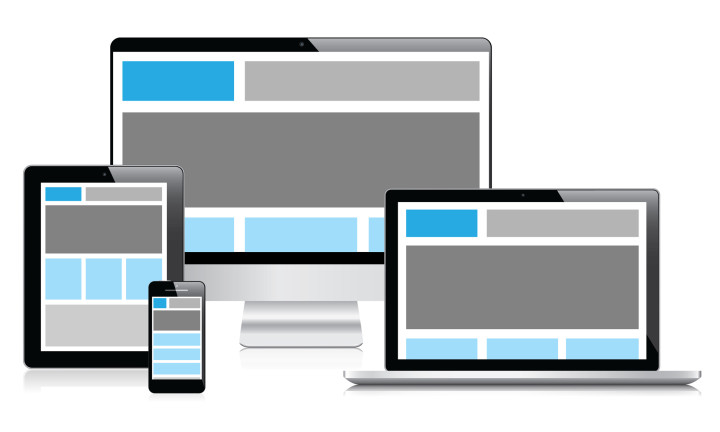
In case you don’t know what responsive means — it’s a way of building a website so that depending on the screen size the entire site reformats itself to fit that screen. Before, as iPhones came along and it became possible to surf the web on your phone, but it was too small and fairly cumbersome to get through a site on that tiny screen people started designing a separate site that was formatted smaller to be be viewed on phones. There were ways for the site to tell if it was being viewed on a phone and show the web version instead, but these sites were often overly simple, and still cumbersome, plus that meant that the designer needed to design two sites, and the company needed to maintain two sites — so that method wasn’t sustainable. So when responsive came along it was quickly adopted as the standard and now Google actually penalizes sites in their search results that are not responsive because a growing number of users are viewing the web on mobile devices.
Oh and responsive means it’s work on any mobile device including tablets. It’ll keep resizing and reformatting as the screen gets smaller. You can test out a responsive design, like my site, by dragging your browser window smaller. When you get to about a tablet size window you’ll see what it will look like on an ipad, when you drag it smaller still you’ll see what it looks like on a phone. Pretty cool huh?
So why this changed everything for me is that I stopped trying to learn html and cram my round self into a square coder hole? (did you catch that little dig at coders? square. geek. get it? anyway…) I knew I wasn’t going to learn this whole new thing of responsive coding. I wasn’t an html wiz! much less javascript and php and now responsive and all this other crap that just looked like the matrix to me.
But there was WordPress, which was originally just a blogging platform, and all the themes looked like blogs, but then people started designing wordpress themes that looked like regular sites. And it kept going until WordPress could be anything for anybody. It has a fairly simple and straight forward interface (it can still be pretty complicated but it makes a lot more sense to me than the matrix like code of html) Plus it has millions of plugins that can help you do pretty much anything you can think of.
So as I was planning to redesign all the sites I had (my design site, the site for guitars, several blogs, the site for the movie, and a new site for the production company I am making for the movie) and seeing that I needed ecommerce functionality, blogging functionality, and regular web pages, at first I was daunted because I thought I was going to have to have 3 different sites for each thing — a site, a blog and a store — but then realized that wordpress could do all of that in one site with one theme!
So I started looking at the premium themes (which I previously viewed as basically cheating in regard to the design) and realized that they were way better than the free ones (there are free ones but they generally suck and really do just look like blogs) and they weren’t that expensive at all. Like $50 usually. And then you take the theme, put in all your content, pictures, change the color palette, style this, change that, and suddenly it is yours. It still takes as long to design as it did before, because there is a lot of work to do, but you’re not reinventing the wheel.
The way I was thinking and working before would be like every time you went to cook something you had to make up the whole thing from scratch without even looking at a recipe, and sometimes you’d even need to make your own pots before you could start cooking. That’d get old for three meals a day huh?
…So, short story long, but that is why I recommend premium responsive themes for wordpress these days. Actually I think I may have just written a blog post for amgleft.com 🙂
Back to the steps for you:
So as you look at these themes (you can view a live demo on each one) you’ll be looking for functionality you want on your site. And if the demo doesn’t have it then the theme probably can’t do it. But if it has everything you want and it seems like there is a bunch of extra stuff you don’t need, don’t worry about that. That’s fine. You can always have a simpler site than they do. You just can’t make it more complicated than they do. Make sense?
So if you want a site that has a cool header and the menu stays at the top of the screen as you scroll down the site, but the theme you’re looking at doesn’t do that, then, well, that theme won’t work for you. The good news is that there are a bajillion themes and there will most likely be a few that you’re having a hard time deciding between because they are all so great.
Also keep in mind, your looking at functionality, not content. If you don’t like the images or the colors that doesn’t matter. You can change all that stuff. But if you don’t like the size of the header, or the way the menu is formatted, that stuff you probably can’t change. Or not all that much.
Don’t worry, I’ll help you choose.
Once you have a theme picked, then you can go through it and start planning your site. You can look at their example page for features with two columns and decide that is how you want to format your “about me” page, or whatever. And from that information, and your rough content outline, I can make a wire frame and sitemap, and then build a website from them, like this one I did last week for the Melanoma Coalition.
Okay, I think that is just about enough of that for right now. Sorry for the longest email ever :-/
Talk to you soon!
Comments ( 0 )